
If you’re designing mobile-first learning experiences using Articulate Storyline 360, you may have noticed an unexpected behaviour that can affect the user experience — particularly for younger or less experienced users.
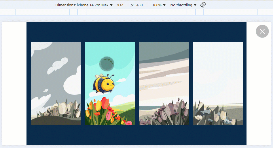
While developing a mobile-only course for a client, feedback during the review stage highlighted an issue I hadn’t fully appreciated until then: swiping across the background of a slide — even when no interactive elements are present — causes the entire slide to shift position slightly.
This behaviour can feel disorientating, and it doesn’t offer any meaningful value to the learner. Instead, it risks detracting from the overall experience, especially if you’re aiming for a clean, app-like interface.
After reaching out to Articulate Support, I was informed that this is considered expected behaviour on mobile devices. This I think is fine whenever a project is using swipe actions in order to control navigation between slides, as the visual cue of the slide movement indicates that the user is about to dismiss the current slide and navigate to the next.
However for projects where perhaps all interaction is taking place on one slide, the movement of the slide by swiping the background only creates confusion as to why we are able to move the slide at all.
By inspecting the output of a published Storyline project, I was able to identify which DOM element is being affected by the swipe gesture. I then wrote a short JavaScript snippet that resets the element’s position on every animation frame, effectively preventing it from moving at all when swiped.
This fix can be applied directly within your Storyline project by adding it as an Execute JavaScript trigger on the Slide Master. That way, it runs automatically on every slide.
Paste the following code into an Execute JavaScript trigger on the Slide Master:
Tip: Make sure this runs when the timeline starts to ensure it’s active as the slide loads.
Importantly, this workaround does not interfere with other mobile-friendly interactions you may be using in your course:
If you try this out in your own project and notice anything that behaves differently as a result, I’d really appreciate your feedback. It’s always helpful to know how these kinds of enhancements perform across different use cases.
You can reach out via the Discover eLearning contact form or drop me a message on LinkedIn.