
In this week’s blog post I am going to show you how with just a small amount of CSS code applied to your Learner Profile page, you can redesign the layout of the standard ‘ld_profile’ widget that is generated by LearnDash LMS.
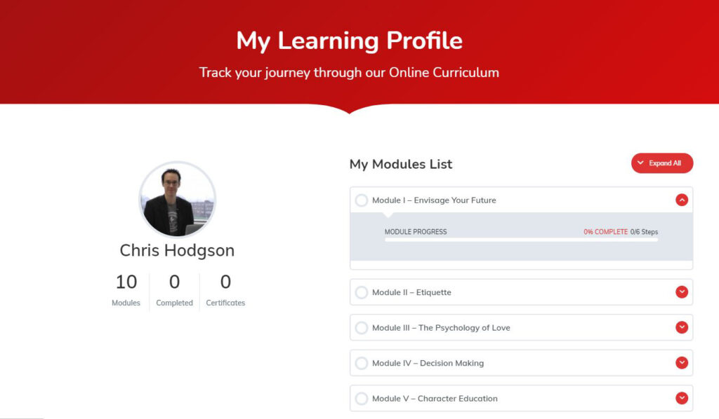
Out of the box, the LearnDash LMS learner profile shortcode widget provides a number of useful information points and links to each learner, dynamically generated for the user on the page where your shortcode has been placed.
This includes the learner’s profile image (which can be changed by the user themselves through the use of Gravatar or a plugin like WP User Avatar installed on your WordPress site), number of courses enrolled as well as courses completed, number of certificate achieved, and a course list for all LearnDash courses which the user is enrolled into.
This widget is displayed to the user in a top-down list style format with the profile and course number information provided as a header above.
The default layout may work perfectly well for you if for example you intend for the profile to be displayed in a boxed layout page, or on small screen devices. However, if you intend to build more of a wide aspect layout for your profile then you may be interested to learn that with a small amount of CSS code applied to your page, you can easily separate the two main components of the LearnDash learner profile widget out from each other, as shown in the screenshot below:
To achieve this layout, just apply the CSS code below to your page:
.ld-profile-summary, .ld-item-list.ld-course-list {width:50%; float:left;}
.learndash-wrapper .ld-item-list .ld-item-list-item .ld-item-list-item-preview {padding:8px;}
To keep in mind however that as your users drops to a narrower screen width, such as those who may visit your site on a smartphone, then this layout will not provide the most optimum user experience. In this case it would be best to return your profile layout to the standard vertically stacked view.
To achieve this, you can use a CSS media query to return the rules put in place above to default when the screen size drops anywhere below 320-400px, which is roughly the area to target for portrait mobile devices as recommended here: https://responsivedesign.is/develop/browser-feature-support/media-queries-for-common-device-breakpoints/
For more great LearnDash LMS tips and tricks, read some of our other helpful articles.